Typography is one of the cornerstones to a well designed website. A good understanding of it can help you layout your content better and create a pleasant experience. For something this important its good to know some basics and common practices in the industry.
Since typography also tends to be very subjective I shall try to keep this article as neutral as possible.
Basics #
Before working with something its best to have some theoretical understanding of what we're dealing with. This section contains basic terminology, that you've most probably encountered before, but may not have fully understood.
1. Typeface vs. Font #
Even though they're often used interchangeably "Typeface" and "Font" mean different things,
- Typeface is the collection of letters, numbers and symbols (also called glyphs) which conforms to a common design philosophy, whereas
- Font is a specific size, weight, or style (e.g. regular, bold, italic) of a typeface.
Eg: Roboto refers to a typeface, while Roboto Regular 400 italic refers to a font
2. Font Categories #
Typefaces come in all different shapes, and there is no single classification system. Below are a few of the most commonly seen categories.
2.1 Serif #
A “serif” is a small stroke attached to the ends of letters, giving them a traditional feel. The "serif" category includes a few sub-categories such as Old Style, Classical, Neo-Classical, Transitional, Clarendon, etc. These typefaces are mostly used in books and newspapers.
Below is the ubiquitous "Times New Roman" font. (Notice how many characters have "feet")

2.2 Sans Serif #
"Sans" comes from the French "without" and as the name states - sans-serif typefaces don’t have these extra strokes, giving them a smooth, modern feel. It includes humanist, geometric and grotesk etc. as sub-categories.
Below is the font called "Futura" in the Sans Serif category. Compared to "serif" fonts these glyphs appear cleaner and more modern.

2.3 Monospace #
Monospaced typefaces are non-proportional - every glyph takes up the exact same space. This gives it a very distinct appearance and is often used in code editors for the ease of reading.
Below is the "Courier" font which is a monospace font.

3. Spacing #
Very often we'll find ourselves wanting to manipulate the way our text looks by altering its spacing. Before we proceed to cover these ways we should first understand what the baseline is.
The baseline is the imaginary line on which most glyphs "sit" and also the benchmark on which we measure the constituents of a glyph. Letters like "y" and "g" in certain typefaces have what is called a descender, a portion of the glyph which lies below the baseline.
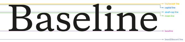
Cap height is the height above the baseline that a capital letter occupies.
3.1 Leading #
Leading is the spacing between the baselines. The analogous css property is line-height
3.2 Kerning #
Kerning is the spacing present in between pairs of characters. Most fonts come with built in kerning tables that define the intended psacing. For example, the letter pair AV are kerned to appear closer to each other to avoid any awkward spaces between them. It is generally advised to use the default kerning values.
3.3 Tracking #
Tracking refers to the overall spacing between the glyphs of the text as a whole. The analogous css property to manipulate this is letter-spacing.
4. "Web safe" Fonts vs Custom Fonts #
A font is "web safe" if most computers have it installed already, and these computers don't have to download it separately when visiting your site. Examples include Arial, Times New Roman, Courier, Georgia, Verdana among others.
A website can declare a custom font as a resource, just like CSS, images or JavaScripts. The visiting browser will then download the font and apply it to the texts on the website.
Using fonts #
You can apply a font by using the "font-family" attribute with the following syntax in CSS.
body {
  font-family: 'custom-font', fallback1, fallback2;
}
Where is the custom-font coming from? Well, it could be from either your OS if you have it installed (e.g. Segoe UI on Windows, or Roboto on Android), or a third party such as Google Fonts, Adobe Fonts etc. In the later case, you most likely need to tell the browser to download it by including the <link> tag in the head of your page, like below.
<html>
  <head>
    <link href="https://fonts.googleapis.com/css?family=Roboto" rel="stylesheet" />
  </head>
</html>
Flash of Unstyled Text #
In the scenario that a custom font used by a website is not available on the visiting computer, it first needs to be downloaded before it can be used. This takes time! The browser will use a fallback font in the font stack until the custom font is loaded. This can cause a "flash of unstyled text (FOUT)".
As an example, suppose you had the font stack below,
body {
  font-family: Apercu, Helvetica;
}
and the font "Apercu" needs to be downloaded by the browser, The texts may flash as the font switches. This is especially apparent if the fallback font being used is sufficiently different.
Some common approaches to mitigate FOUT include,
- using a third party (e.g. Google Fonts, Adobe Fonts etc.) to optimise the font files and deliver them via a CDN,
- picking a fallback font that's similar to the custom font you want to use.
- In some cases if the font supports many glyphs which wont be used on the page you can consider splitting the font file to optimize its size
Native font stack #
A “native font stack” allows for optimum text rendering on every device and OS with zero latency. For example, Bootstrap 4 uses the following native font stack by default,
$font-family-sans-serif:
  // Safari for OS X and iOS (San Francisco)
  -apple-system,
  // Chrome < 56 for OS X (San Francisco)
  BlinkMacSystemFont,
  // Windows
  "Segoe UI",
  // Android
  "Roboto",
  // Basic web fallback
  "Helvetica Neue", Arial, sans-serif,
  // Emoji fonts
  "Apple Color Emoji", "Segoe UI Emoji", "Segoe UI Symbol" !default;
Published