Now that we have covered some of the basics of typography, we can get to the fun stuff - quick tips to rapidly make your web page content look better!
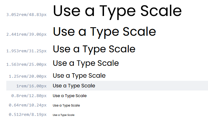
1. Use a Type Scale for a pleasing set of font sizes #
Using a Type Scale helps you define a set of font sizes easily, practically, and without any kind of guesswork.
As the name suggests, a Type Scale works based on a scale factor (say 1.25 - the Major Third scale). The idea is that you start with a base font size (16px) and multiply (or divide) it with the scale factor to get font sizes of either a higher (ie; H₁, H₂, etc…), or lower hierarchy (ie; Caption, Button etc…)
A Type Scale will help you produce texts that look harmonious because their sizes increase, and decrease along a fixed scale that you’ve set.
Visit type-scale.com for a good online tool to choose one.
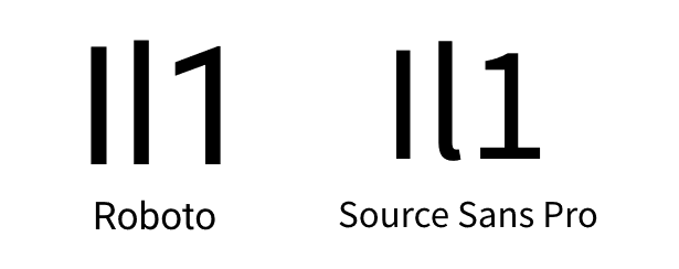
2. Use the x-height or il1 test to determine readability of your chosen Typeface. #
The x-height is the height of a lowercase ‘x’ relative to an upper case letter of the same Typeface. If your font has a large x-height then this will generally make for much better readability, especially when used in long-form body text.
Another way to determine the readability of a Typeface, and to narrow things down if you have a few Typefaces that you can’t decide between, is to do the il1 Test. Here you compare three characters from a specific Typeface; Uppercase i (I), Lowercase L (l), and the number one (1).
How different the letterforms look against one another can help determine readability, especially when working with Sans Serif Typefaces.
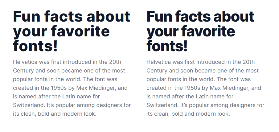
3. Reduce Letter-spacing on your Headings to give a better optical balance. #
Your Headings are most likely going to be much larger, and heavier than their Body text companions, so the spacing between the letters can sometimes appear optically larger, which is not always what you want when you're looking for that perfect aesthetic.
Reducing the Letter-spacing, just by tiny amounts, can make your Headings more optically balanced, more readable, and generally more pleasant to look at.
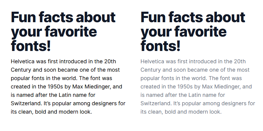
4. Lighten up your text if it's looking a little too heavy. #
When it comes to long-form content, certain Regular weight Typefaces can still look a little too heavy, and stark.
Easily fix this by opting for something like a Dark Grey (ie; #4F4F4F) to make that text a little easier on the eye.
5. Use Superfamilies when you're looking for great font combinations, but fast. #
When you're looking to improve your typeface-combining skills and feel a little daunted when faced with 1000s of Typefaces to choose from, just go with a Superfamily!
Superfamilies are collections of Typefaces that can come in both Serif, and SansSerif variants for example, and are created to work together in close visual harmony. A few that I highly recommend are Merriweather & Merriweather Sans, and Roboto & Roboto Slab which you can find here at Google Fonts.
6. When creating long-form content, give 20pt and above a try. #
For long-form content (ie; Blog Posts, Project Descriptions, and all that kind of stuff), try opting for 20pt (or even a little more) with your Body text.
Of course this is dependent on the Typeface chosen, but a good majority of popular Body Typefaces work great at 20pt, and bring a much better reading experience for the user when faced with a wall of text.
Published